


GARIYE wanted more than a logo—they needed a full-on brand experience that reflected their mission and set them apart in the Iraqi retail sector. We delivered a brand identity rooted in the symbolism of community, vibrancy, and natural abundance. The design system is coherent, scalable, and intentionally crafted to bridge the old-world feel of a village with modern, urban expectations. Every visual cue, from color to form, pulls its weight to elevate the brand in-store, online, and in people’s minds.
GARIYE launched as a chain of stores to deliver essential food and goods to the Iraqi market. The brand name means “village,” so the identity needed to capture the vibe of a lively, welcoming rural hub—but it also had to look modern, reliable, and scale across multiple locations. The branding had to bridge tradition with a corporate system, cut through a cluttered retail landscape, and instantly signal freshness, health, and variety with a distinct and memorable mark.
We built the GARIYE logo around a central circle—symbolizing both community and infinity, anchoring the visual language. Inside, we used vibrant greens, blues, yellows, and oranges:
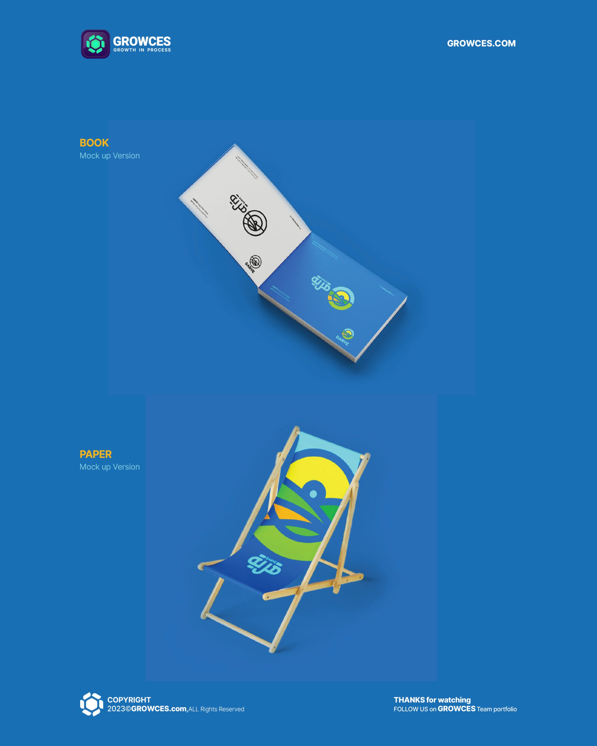
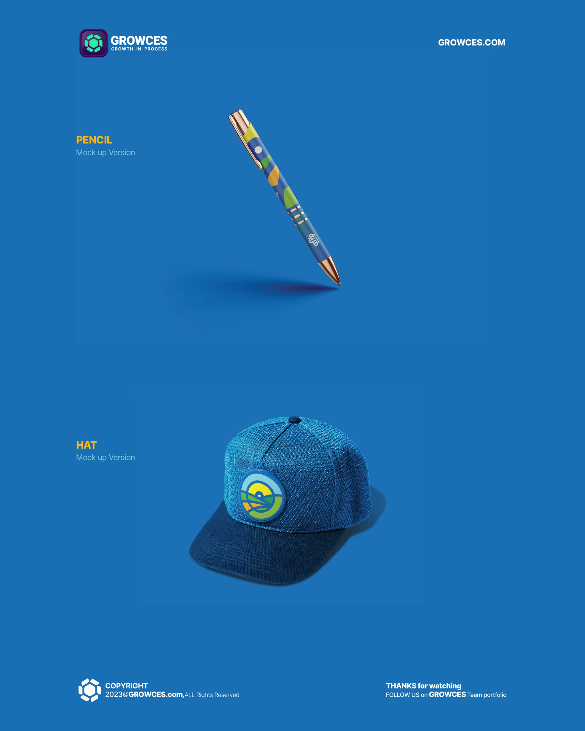
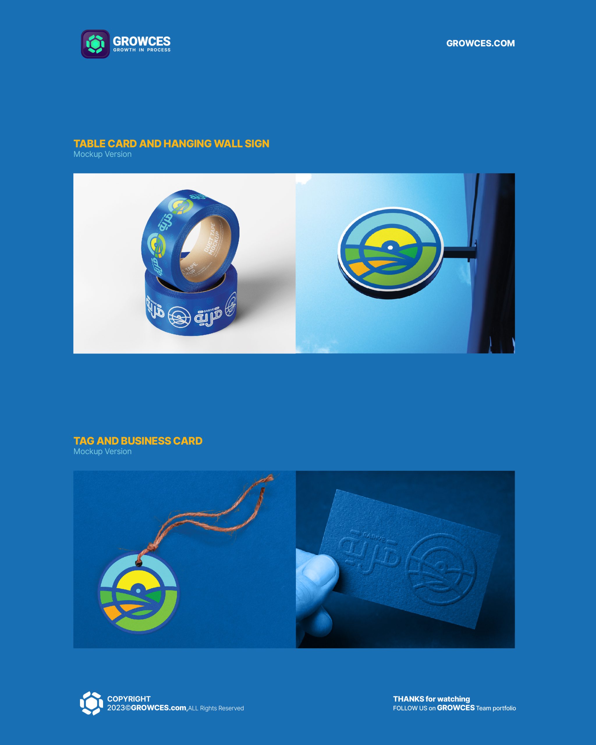
We didn’t just slap some colors together; the composition mirrors the vitality and diversity of a true rural market. Every element, shape, and shade speaks to the brand’s promise: a place where daily essentials are fresh, accessible, and connected to local life. The design is unmistakably lively and inclusive, built to work on storefronts, packaging, and digital platforms.

GARIYE now has an identity that’s not just visually appealing, but actually works in the real world:
Long story short: the identity makes the brand memorable and trustworthy in a competitive market, while giving the chain flexibility to grow.
There’s no point in designing “pretty” for the sake of pretty. In a market crowded with forgettable marks and generic concepts, GARIYE stands out because the branding actually means something relevant to the audience and functions perfectly across all touchpoints. This is proof, again, that strategy and execution matter—if you want brand loyalty and real business traction, start with design that’s both meaningful and ruthlessly practical.